Put all the styles for this worksheet into the internal style sheet in this page so you don't clutter up your main style sheet.
Create your own background image that will tile seamlessely (hopefully) using the "Flip-Flip" technique as I explained in class and in my "Flip-Flip" example. Ideally, you'll make one that compliments the aesthetic of your course page because you might want to use it there, but that's not required. Here are some tips:
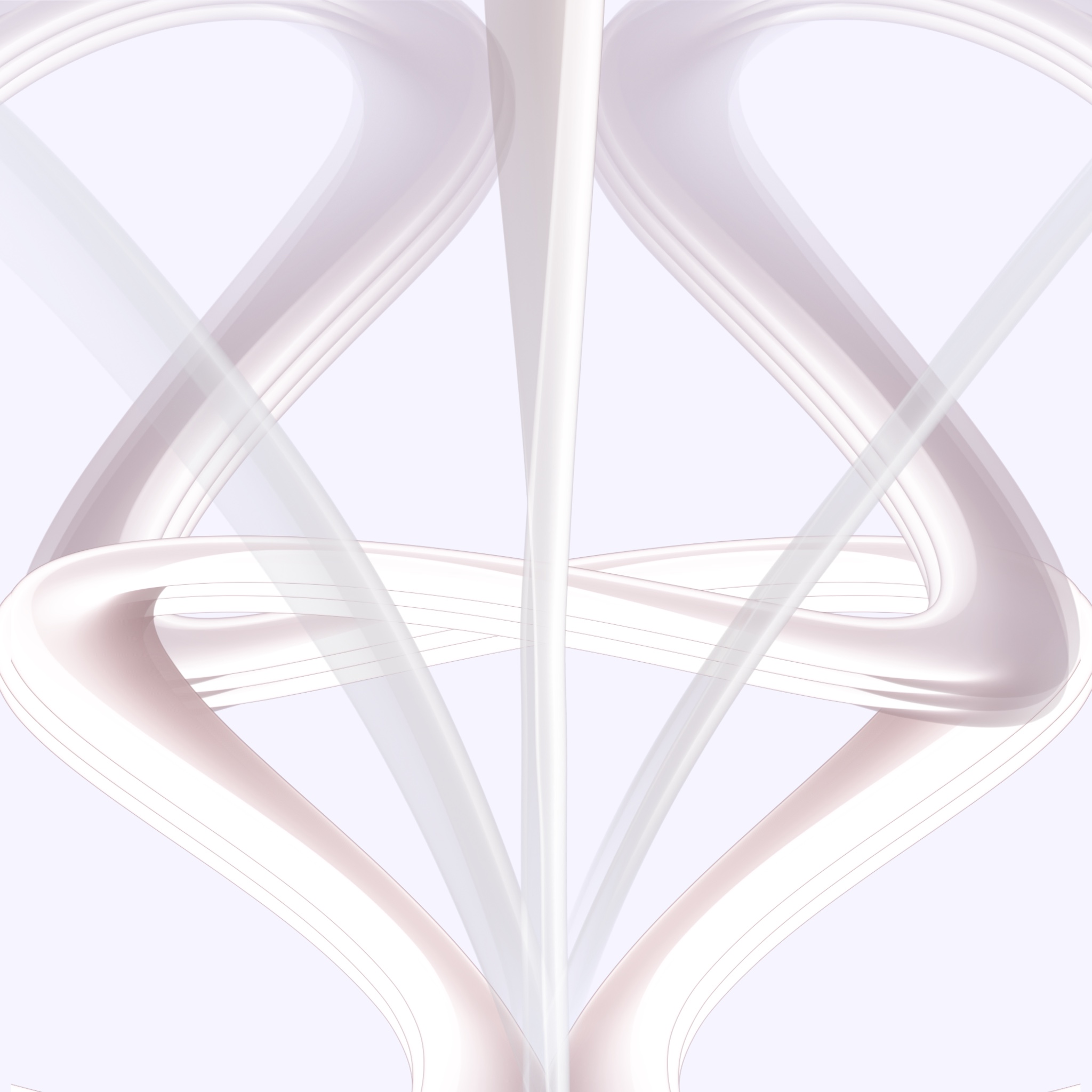
Put the original graphic here:
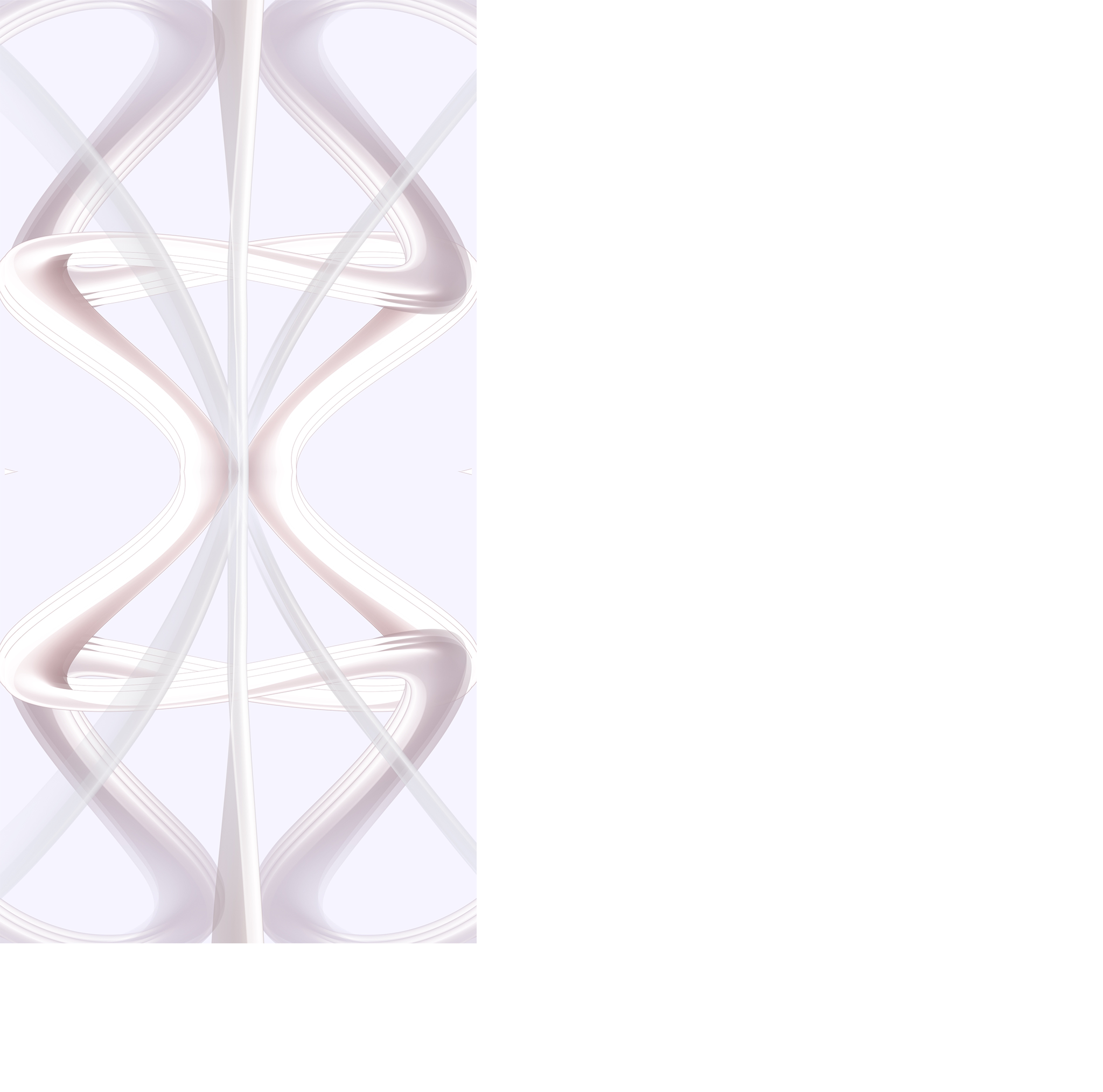
Put the graphic after one Flip (reflection) here:
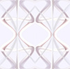
Put the final graphic here (non-tiled of course):
Create your own background image that will tile seamlessely (hopefully) using the "Flip-Flip" technique as I explained in class and in my "Flip-Flip" example. Ideally, you'll make one that compliments the aesthetic of your course page because you might want to use it there, but that's not required. Here are some tips:
- Start with a fairly small graphic (50x50 or whatever). Remember, when you use the "Flip-Flip" technique, a 50x50 graphic will end up as 100x100.
- Don't start with something you find that already tiles since that defeats the purpose. Get creative. Students have make some really cool textures.
- Aim to create something actually usable as a background texture - reasonably subtle and won't overpower content.
Put the original graphic here:
Put the graphic after one Flip (reflection) here:
Put the final graphic here (non-tiled of course):
Tile the custom background image you created above in both the X and Y directions (that's the default behavior) inside this block. If you constructed it properly, it should tile (repeat) seamlessly.
Put the custom background image you created above inside this block, but as no-repeat so it won't tile. Center it vertically within this block, and place it 20% away from the right border. You can tell that it's a background graphic (instead of HTML img tag) because the lorem ipsum text will be on top of the graphic.
Lorem ipsum dolor sit amet, consectetuer adipiscing elit, sed diam nonummy nibh euismod tincidunt ut laoreet dolore magna aliquam erat volutpat. Ut wisi enim ad minim veniam, quis nostrud exerci tation ullamcorper suscipit lobortis nisl ut aliquip ex ea commodo consequat. Duis autem vel eum iriure dolor in hendrerit in vulputate velit esse molestie consequat, vel illum dolore eu feugiat nulla facilisis at vero eros et accumsan et iusto odio dignissim qui blandit praesent luptatum zzril delenit augue duis dolore te feugait nulla facilisi. Nam liber tempor cum soluta nobis eleifend option congue nihil imperdiet doming id quod mazim placerat facer possim assum. Lorem ipsum dolor sit amet, consectetuer adipiscing elit, sed diam nonummy nibh euismod tincidunt ut laoreet dolore magna aliquam erat volutpat. Ut wisi enim ad minim veniam, quis nostrud exerci tation ullamcorper suscipit lobortis nisl ut aliquip ex ea commodo consequat. Duis autem vel eum iriure dolor in hendrerit in vulputate velit esse molestie consequat, vel illum dolore eu feugiat nulla facilisis at vero eros et accumsan et iusto odio dignissim qui blandit praesent luptatum zzril delenit augue duis dolore te feugait nulla facilisi. Nam liber tempor cum soluta nobis eleifend option congue nihil imperdiet doming id quod mazim placerat facer possim assum.
Lorem ipsum dolor sit amet, consectetuer adipiscing elit, sed diam nonummy nibh euismod tincidunt ut laoreet dolore magna aliquam erat volutpat. Ut wisi enim ad minim veniam, quis nostrud exerci tation ullamcorper suscipit lobortis nisl ut aliquip ex ea commodo consequat. Duis autem vel eum iriure dolor in hendrerit in vulputate velit esse molestie consequat, vel illum dolore eu feugiat nulla facilisis at vero eros et accumsan et iusto odio dignissim qui blandit praesent luptatum zzril delenit augue duis dolore te feugait nulla facilisi. Nam liber tempor cum soluta nobis eleifend option congue nihil imperdiet doming id quod mazim placerat facer possim assum. Lorem ipsum dolor sit amet, consectetuer adipiscing elit, sed diam nonummy nibh euismod tincidunt ut laoreet dolore magna aliquam erat volutpat. Ut wisi enim ad minim veniam, quis nostrud exerci tation ullamcorper suscipit lobortis nisl ut aliquip ex ea commodo consequat. Duis autem vel eum iriure dolor in hendrerit in vulputate velit esse molestie consequat, vel illum dolore eu feugiat nulla facilisis at vero eros et accumsan et iusto odio dignissim qui blandit praesent luptatum zzril delenit augue duis dolore te feugait nulla facilisi. Nam liber tempor cum soluta nobis eleifend option congue nihil imperdiet doming id quod mazim placerat facer possim assum.
Now put the custom background image you created above inside this block twice at different locations and as two different sizes. Again, use no-repeat so they won't tile. You can choose the locations, and sizes but just make sure they are not on top of each other I can see them both. You will find the relatively new CSS3 Background Properties useful in this endeavor.
Lorem ipsum dolor sit amet, consectetuer adipiscing elit, sed diam nonummy nibh euismod tincidunt ut laoreet dolore magna aliquam erat volutpat. Ut wisi enim ad minim veniam, quis nostrud exerci tation ullamcorper suscipit lobortis nisl ut aliquip ex ea commodo consequat. Duis autem vel eum iriure dolor in hendrerit in vulputate velit esse molestie consequat, vel illum dolore eu feugiat nulla facilisis at vero eros et accumsan et iusto odio dignissim qui blandit praesent luptatum zzril delenit augue duis dolore te feugait nulla facilisi. Nam liber tempor cum soluta nobis eleifend option congue nihil imperdiet doming id quod mazim placerat facer possim assum. Lorem ipsum dolor sit amet, consectetuer adipiscing elit, sed diam nonummy nibh euismod tincidunt ut laoreet dolore magna aliquam erat volutpat. Ut wisi enim ad minim veniam, quis nostrud exerci tation ullamcorper suscipit lobortis nisl ut aliquip ex ea commodo consequat. Duis autem vel eum iriure dolor in hendrerit in vulputate velit esse molestie consequat, vel illum dolore eu feugiat nulla facilisis at vero eros et accumsan et iusto odio dignissim qui blandit praesent luptatum zzril delenit augue duis dolore te feugait nulla facilisi. Nam liber tempor cum soluta nobis eleifend option congue nihil imperdiet doming id quod mazim placerat facer possim assum.
Lorem ipsum dolor sit amet, consectetuer adipiscing elit, sed diam nonummy nibh euismod tincidunt ut laoreet dolore magna aliquam erat volutpat. Ut wisi enim ad minim veniam, quis nostrud exerci tation ullamcorper suscipit lobortis nisl ut aliquip ex ea commodo consequat. Duis autem vel eum iriure dolor in hendrerit in vulputate velit esse molestie consequat, vel illum dolore eu feugiat nulla facilisis at vero eros et accumsan et iusto odio dignissim qui blandit praesent luptatum zzril delenit augue duis dolore te feugait nulla facilisi. Nam liber tempor cum soluta nobis eleifend option congue nihil imperdiet doming id quod mazim placerat facer possim assum. Lorem ipsum dolor sit amet, consectetuer adipiscing elit, sed diam nonummy nibh euismod tincidunt ut laoreet dolore magna aliquam erat volutpat. Ut wisi enim ad minim veniam, quis nostrud exerci tation ullamcorper suscipit lobortis nisl ut aliquip ex ea commodo consequat. Duis autem vel eum iriure dolor in hendrerit in vulputate velit esse molestie consequat, vel illum dolore eu feugiat nulla facilisis at vero eros et accumsan et iusto odio dignissim qui blandit praesent luptatum zzril delenit augue duis dolore te feugait nulla facilisi. Nam liber tempor cum soluta nobis eleifend option congue nihil imperdiet doming id quod mazim placerat facer possim assum.
Put a tall, thin gradient background image (around 10px in width give or take) that tiles only in the X direction. (You can use a thin, wide gradient image that tiles only in the Y direction if you would prefer.) Either way, make sure it fades away to nothing (from a solid color to white) in about 1/3 of the height of the block (or width if you did repeat-y) so that 2/3 of the height is white.
Here are a couple free gradient image generators: www.generateit.net angrytools.com
Here are a couple free gradient image generators: www.generateit.net angrytools.com
Use the pure CSS gradient capability that recently became available in CSS3 to try to replicate the above experiment with gradient graphics. In particular, none of the examples in the W3Schools page quickly fade to white in about 1/3 of the block like you are supposed to to do using a gradient graphic above. See if you can figure out how that can be done with pure CSS gradients.